
Most school websites do not need dozens of unique designs. They need a clear page map: a focused homepage, one reusable internal layout for About and Academics, plus news, events, contact and policy. A practical guide for principals and school web committees planning a redesign.
When a school redesigns its website, the brief often grows faster than the site. Every department wants its own look. Academics wants a different layout from Admissions. The sports page should feel energetic. The policy page should feel serious. Before long, the committee is discussing twenty designs when the real question is simpler: what pages do parents need, and how many unique layouts does the school actually need to maintain?
Over 15 years I have built more than 50 websites, including 20 or more for schools. Across those projects, a pattern holds. Most school websites work well with a small set of page types: a homepage, a reusable internal page used many times, a news list and detail, an events list and detail, a contact page, and a policy page. That is not a rule for every school. It is a map that has covered the majority of what schools asked for, without turning the redesign into a one-off custom site for every section.
This guide is written for principals, administrators and web committees. It is not a design portfolio, and it is not a vendor checklist. It is a way to decide what to build first, what to reuse, and what can wait until the core is working.
If you are also fixing an existing site, pair this page map with the common mistakes that quietly cost admission enquiries: 13 school website mistakes.
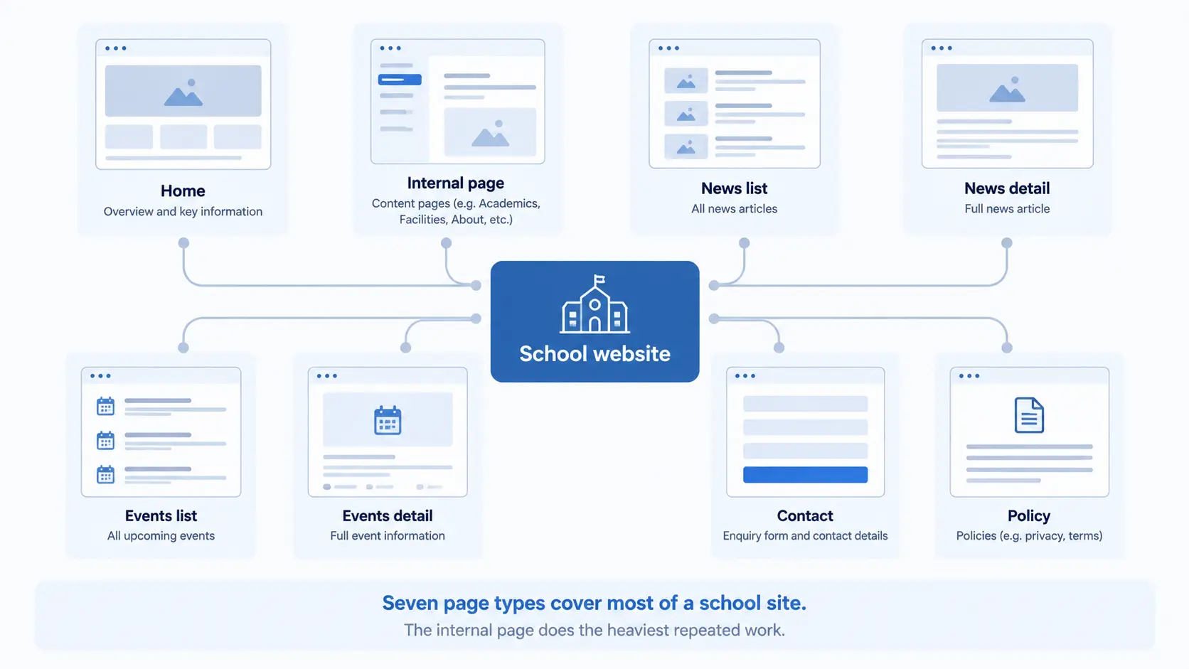
The page map at a glance
Here is the set in plain terms.
- Home: orientation for a first-time parent, plus a clear next step.
- Internal page: one flexible layout reused for About, Academics, Admissions, Facilities, leadership and similar content pages. On many school sites this layout is used dozens of times.
- News list and news detail: announcements and stories with a date and a category.
- Events list and event detail: dated activities with time, place and audience.
- Contact: how to reach the school, with a form the office can actually handle.
- Policy: readable pages for privacy, terms and other school policies.
Colleges and universities often use the same types. Their content priorities differ (programmes, fees and outcomes weigh more), but the page map itself is close enough that the same thinking applies. The rest of this post stays with K–12 schools, because that is where parent decisions and office workflows are most familiar.
If you are mid-redesign, you do not need every page on day one. You do need agreement on the map, so new content has a place to live instead of spawning a new design request each week.
1. The homepage: a glimpse, not a brochure
The homepage is the face of the school for a parent who has never visited. It has a short window to do three jobs: say what kind of school this is, show that the information is trustworthy, and point to a next step such as admissions or a campus visit.
It is not the place to tell the full story. A long narrative belongs on About. A full programme list belongs under Academics. On the homepage, a parent scanning on a phone should leave with a clear impression and an obvious action, not a feeling that they have to read everything before they are allowed to enquire.
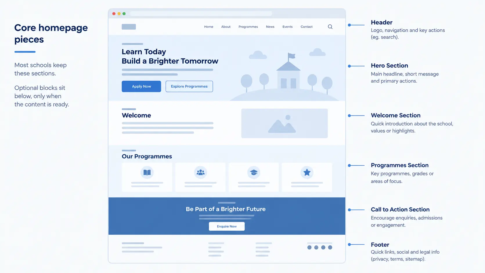
Core homepage pieces most schools treat as essential
These are the parts schools rarely regret keeping.
- Header with logo, main navigation and an admissions-related button. Navigation should use labels parents understand (How to Apply, Academics, About, Contact) rather than internal department names.
- Hero with one clear heading, a short supporting line, and one or two actions. Apply or Enquire, and Schedule a Visit, cover most schools. The main heading should be a real H1 about the school, not a decorative slogan nobody can parse.
- A short welcome or about glimpse with a link to the full About page. One photograph that represents the school is enough here. Prefer campus or leadership imagery the school has permission to use; be careful with identifiable student faces on public pages.
- A programmes or grade-band strip: Pre-Primary, Primary, Middle, Senior, or whatever bands you actually run, linking into internal pages.
- A closing call-to-action block repeating the visit or apply path.
- Footer with a short school line, key links, contact details and social profiles the school actually maintains.
Homepage sections that earn their place when you have strong content
These help when the material is real and current. They are optional on launch day.
- Why choose us, as a small set of proof points rather than a long essay
- Simple highlight figures the school is willing to stand behind (years, class sizes, recent results). Avoid inflated claims
- Campus life cards linking to fuller internal pages
- Parent or alumni voices, with names the school has permission to publish
- A small news or events preview with a link to the full list
You do not need every block. A crowded homepage loses the parent who came for one answer. If a section does not help someone decide or find something, keep it off the first screen and off the first release.
2. The internal page: one layout, used many times
This is the part committees underestimate, and it is usually where a school website either stays maintainable or becomes expensive.
About the school, vision and mission, leadership, individual grade or programme pages, facilities, transport, fee information overview, careers: these are different topics with the same job, present structured information, answer questions, and guide the reader to the next step. They do not each need a unique design.
A practical internal layout often includes:
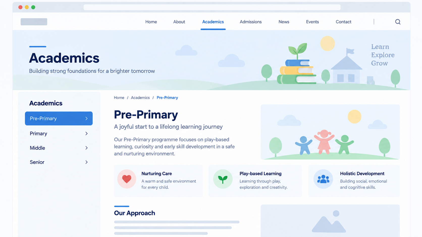
- A simple page hero with the page title and breadcrumb (Home → section → page)
- Side navigation listing the other pages in that category, with the current page highlighted. If a parent is on Pre-Primary under Academics, the sidebar shows Primary, Middle, Senior and the rest of the Academics pages beside it. The same idea applies under About or Admissions: related pages in that section stay visible so the parent can move across them without returning to the main menu.
- A main content area built from repeatable sections (detailed below)
- A shared news teaser and a shared call-to-action when those help the page
Main content sections the office can mix
The main column is where the page earns its keep. Instead of a fixed layout for every topic, give the office a small set of content blocks they can add, reorder and repeat on the same page. A Pre-Primary page might use text, text with image, cards and FAQ. An admissions process page might use text, a table and FAQ. Same building blocks, different combination, so a new page does not need a new design each term.
- Text: For introductions, the school’s approach, or a process explained in words. Use this when the parent mainly needs to read and understand, then take a clear next step if there is one.
- Text with image: The same job as text, with a photograph or simple diagram beside or below the words. Useful for facilities, classrooms, labs and leadership, when a picture makes the place feel real. Keep images permissioned and light enough for phones.
- Table: For facts parents compare side by side: fee heads, grade-wise timings, document lists, or what each programme band offers. Prefer a real table on the page over a PDF when families will check it on a phone.
- FAQ: Expandable answers to questions the office already hears on the phone: admission steps, age criteria, documents, transport, fees, differences between grade bands. Place this where the same doubts keep coming up, often on Admissions and Academics pages.
- Cards: Short highlight tiles (optional photo, title, a line or two) for teaching approach, labs, sports, arts or support. Use when several points should be scanned quickly, not when you need a long explanation.
- Gallery: A photo grid for classrooms, sports, library, labs or performances, with a larger view when someone taps an image. Add it when pictures help; skip it when the page only needs facts, and follow the school’s usual consent practice for student images.
These blocks can appear more than once on one page. The office should be able to build a page by choosing the combination it needs.
The point of the system is not visual novelty. It is that someone in the school office can assemble a new Admissions FAQ page or a new Middle School page from existing sections, without waiting for a redesign cycle every time the academic year changes.
On larger school sites, that one internal layout is used far more than any other page type, often dozens of times. If you only invest deeply in two things, invest in a clear homepage and a flexible internal page your staff can actually use.
3. News list and news detail
News is for stories and notices: annual day, a result highlight, a circular summary, a community update. Parents should be able to scan recent items, filter by category if the school publishes enough volume, and open a single article without hunting through social media.
List page. Keep the school header and footer. Add a simple hero with the page title. If you use categories (Sports, Academics, Events, Notices), keep the labels few and stable. Show a grid or list of cards with image, title, date and a short line. “Read more” should go to the detail page, not a PDF by default. PDFs are awkward on phones; use them when a document truly needs downloading.
Detail page. Title, date, category and optional author or office name at the top. One featured image. Then the article itself. Related or recent news beside or below the article helps a parent keep reading without returning to the list.
Optional content blocks when a story needs more than a paragraph:
- Highlights
- Image set
- Quote
- FAQ
Many news items need only a clear paragraph. Use the extras when the story genuinely needs them, for example a results notice with bullet highlights, or annual day with a small photo set. Not every article should carry the full set.
The operational rule matters as much as the layout: someone in the office should be able to publish a news item during the week without calling a developer.
4. Events list and event detail
Events are dated. That is the difference that matters.
Sports day, parent-teacher meetings, open days, annual day, board exam briefings: these need a start date, often a time and a place, and a clear audience (students, parents, a particular grade). A news story can look back. An event page should help a family decide whether to attend and what to bring or expect.
List page. Show current and upcoming items first. Simple filters such as All, Academics, Sports, Cultural help when the calendar is busy. Each card needs a date that stands out, a title, a short description and a link to details. Loading more items is better than dumping a full year on one screen.
Detail page. Event title, key facts up front (dates, times, location, who it is for, category), then a fuller description. A shared call-to-action (enquire, visit, or contact the office) is enough for most schools. Photo galleries belong here when the school has cleared images to publish after the event; they are not required for every listing.
If your school already keeps a year calendar, the website should reflect it, not fight it. The list page is for discovery. The detail page is for the facts a parent will screenshot or forward to a spouse.
5. Contact
Contact looks simple and fails often.
Parents need an address, phone, email, working hours and a map they can trust. They also need a form that asks only what the office will actually use: name, phone, email, type of enquiry (visit, admissions, fees, general), and a message. Every extra field lowers completion. Every form that only lands in a crowded shared inbox creates delay.
Put the form and the contact details side by side on larger screens, stacked cleanly on phones. Promise a realistic response window only if the school will keep it. Test the form yourself once a month. A beautiful contact page with a broken form costs enquiries quietly.
6. Policy pages
Policy pages do not need drama. They need readability.
Privacy policy, terms, and other school policies work well with the same header and footer, a clear title, breadcrumbs and structured text: short paragraphs, headings and bullet lists, with links to related pages where useful. Parents and staff should be able to find the document from the footer. Keep a visible last-updated date when the school revises the text, so nobody is left wondering whether the page is current.
Do not treat policy as a PDF dump if the content can live as a normal page. Search and phones both favour text on the page.
What to build first
If the full map feels large, sequence it.
Phase 1. Homepage with core sections. Internal layout ready for About, Admissions and at least one Academics page. Contact with a working form. One policy page the school already needs.
Phase 2. News list and detail, so the office can publish without WhatsApp as the only channel.
Phase 3. Events list and detail when the calendar is active enough to deserve its own section. Until then, major events can appear as news, with dates in the title and body, as long as someone owns the updates.
Phase 4. Extra internal pages (facilities, transport, careers, alumni) using the same layout, not new designs.
Agree the map in writing before visual design begins. That single step prevents half of the scope arguments that slow school website projects.
Who should own which page
A page map fails when nobody owns updates.
- Homepage and admissions path: leadership plus admissions office, reviewed before each admission season.
- Academics and programme internals: academic coordinators, with one web owner who knows the template.
- News and events: office or communications, with a simple weekly habit rather than a burst at annual day.
- Contact form follow-up: a named person, not “the admin inbox”.
- Policies: whoever is responsible for the document in real life, with a publish date on the page.
If your team cannot update a page without an external developer, fix that before you add more page types. Structure without ownership becomes another unread brochure.
Most school websites need fewer unique designs than committees expect. They need a clear page map and one internal layout the office can reuse.
A one-meeting checklist for your web committee
List every page you think you need. Mark each as Home, Internal, News, Event, Contact or Policy.
Circle the internal pages that can share one layout instead of asking for unique designs.
Agree Phase 1 pages before anyone debates colours or hero videos.
Open your current site on a phone and time how long it takes a stranger to find How to Apply and Contact.
Confirm who will publish news, who will answer the form, and who will update admissions dates.
Write the page map into the redesign brief so scope cannot quietly expand week by week.
Frequently Asked Questions
