After 15 years of building websites, including more than 20 for schools, the same problems keep coming back. Heavy homepages, confusing navigation, forms that go nowhere. Here are 13 mistakes school teams tend to regret later, along with what to check before your next redesign begins.
A few years ago I finished a school website that had more than fifteen high-definition photographs on the homepage. The school had chosen every one of them. Toppers holding certificates, the annual day stage, the new science block, a graduation group photo. Each image mattered to somebody on the committee, so none of them could go.
The site was slow. Predictably, painfully slow. And when the school came back to me, the conversation was not about the images. It was about my work not being good enough. I suggested we reduce the number of photos and optimise the rest. They did not agree to either. The images stayed, and so did the problem.
I have thought about that project many times since, because the pattern repeats. Over 15 years I have built more than 50 websites, including 20 or more for schools, and the failures are rarely about design taste. They come from small technical decisions made quietly during the build, decisions nobody revisits until enquiries drop and everyone starts looking for someone to blame.
This is a list of those decisions. Thirteen of them. It is written for principals, administrators and web committee members rather than developers, so where something technical matters I have explained it in plain terms. You do not need to fix all of these at once. Reading the list and knowing which questions to ask is most of the value.
1. An autoplay video in the hero section
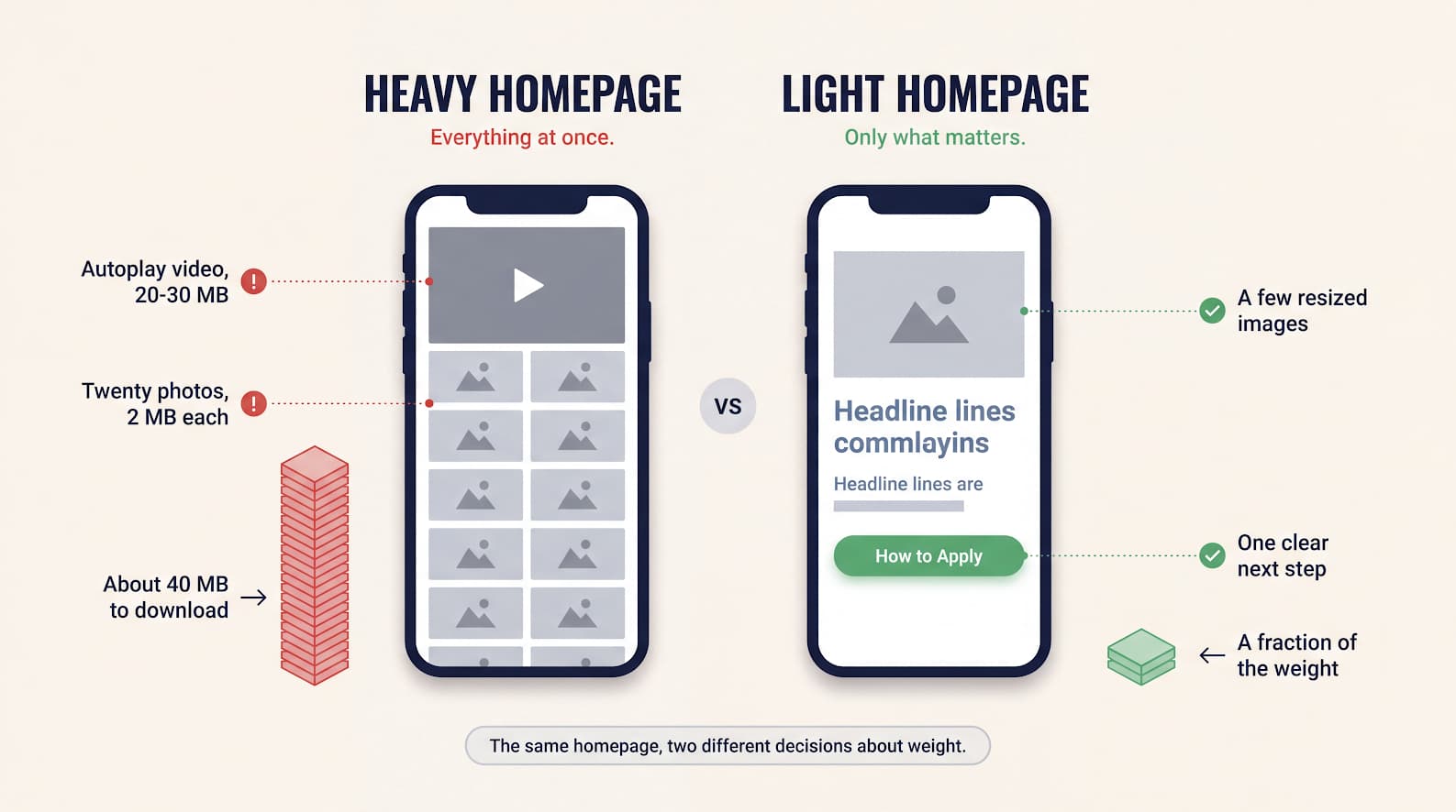
Video in the hero section is the single most common request I get, and the most expensive one. A school uploads an MP4 to its own server, drops in an HTML player, and the file turns out to be 20 MB, sometimes over 30 MB. That file often begins downloading before anything useful appears on screen, which means the parent waits on a progress bar instead of reading why your school is worth considering. On a mid-range phone on mobile data, the device also has to decode a large file while it is still trying to draw the page.
My honest advice is to avoid an autoplay hero video. A strong photograph with a clear headline almost always performs better, because it appears instantly.
If the school insists, and sometimes it will, make it survivable. Show a still image first so parents see something immediately. Keep the file genuinely small, ideally a few megabytes rather than 20 or 30, and treat 5 MB as a ceiling rather than a target. Load it only after the main content is ready. An adaptive streaming service such as Cloudflare Stream will generate several resolutions and serve the right one for the viewer's connection, which is a real improvement over hosting one large file yourself.
Embedding from YouTube or Vimeo instead is a trade. It removes the hosting burden, but each embed pulls in a fair amount of external JavaScript that slows your page, and platform branding or suggested videos can appear around your content. As a general rule, keep embeds out of the top of the homepage.
2. Twenty high-resolution photographs on the homepage
This is the mistake from my story, and it comes from a good instinct. Schools want to show real achievement, real students, real facilities. The problem is quantity and file size, not pride.
Twenty photographs at 2 MB each is roughly 40 MB of images on a single page. Even with careful loading, that is far more than a homepage needs to make its point, and every extra photograph competes for the attention of a parent who is scanning, not studying.
A better approach is to choose a small number of images that genuinely earn their place on the homepage, then build a proper gallery page for everyone who wants more. Before uploading, resize photographs down to sensible dimensions rather than posting straight from the camera at 4000 pixels wide. Ask your developer to serve appropriately sized versions to different devices, so a phone is not downloading a desktop-sized image. In technical terms this is
srcset
; you only need to know that it should be in place. Images below the first screen should load as the parent scrolls rather than all at once.
One practical note from experience: this conversation goes better before the site is built than after. Agree on a homepage image budget early, in writing.
3. Navigation that does not match how parents actually look
A website without clear navigation wastes everything spent on bringing people to it. Suppose your marketing brings a parent to the homepage. They read, they are interested, and now they want to know how admission works. The page exists. But if nothing in the menu says something close to "How to Apply", they will not go hunting for it.
Two or three levels of navigation, organised the way a parent thinks rather than the way the school is organised internally, solves most of this. About holds the school's story, vision and mission, leadership and staff. Admissions holds how to apply, the process, important dates and forms. Academics holds the sections and grades. Whether it appears as a top bar with dropdowns or a full-screen menu matters far less than whether the labels are obvious.
Use plain language for labels. "How to Apply" beats "Prospective Parents". If a label needs explaining, it is the wrong label. How to arrange those as a hub and sub-pages is covered in What to Put on a School Admissions Page .
4. No obvious next step
Many school websites never tell the visitor what to do. There is no "How to Apply", no "Book a School Visit", no clear way to reach the admissions office. A parent finishes reading, feels positive, and then simply leaves, because nothing suggested a next step.
Give every important page one obvious action. Keep an admissions button visible in the top navigation, and repeat it where interest naturally peaks, such as after the section describing your programmes or facilities. Make it visually distinct so it reads as a button rather than another line of text.
The aim is not to pressure anyone. It is to make sure a parent who has already decided to enquire does not have to work for it.
5. Forms that go nowhere
Having given the parent an obvious next step, the next mistake is failing to catch it. An enquiry form is often the only conversion point on a school website, and it is frequently the weakest part of it. I have seen forms with fields that do not capture what the office actually needs, forms without validation that accept obviously incorrect phone numbers, and forms that quietly stopped working after a plugin update and were not noticed for weeks.
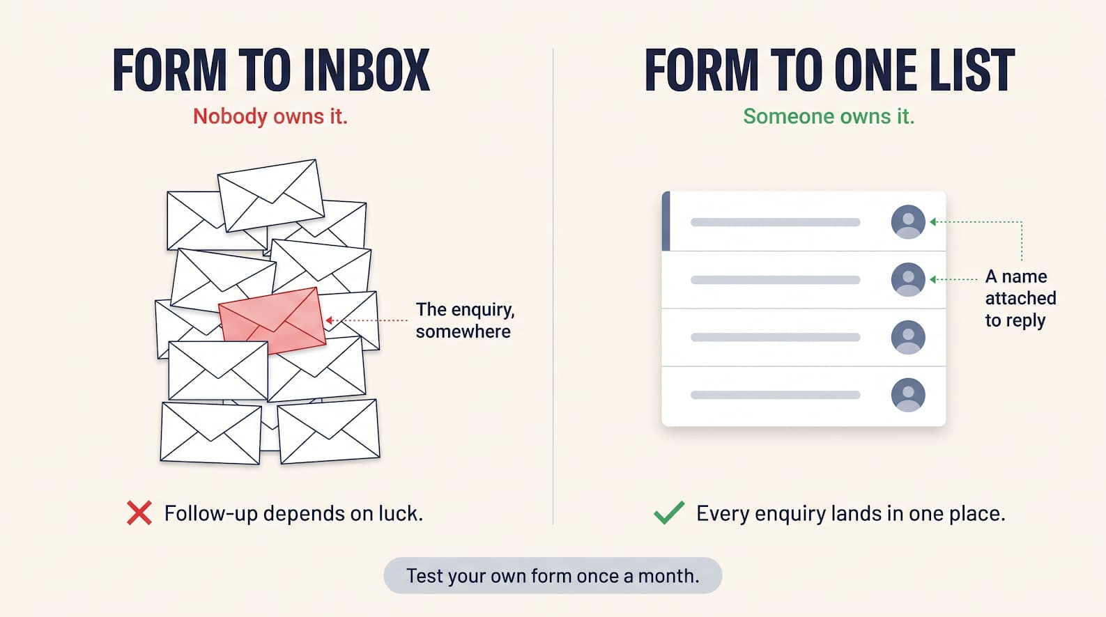
The more common failure is subtler. The form works, and it sends an email to an admin inbox where it settles among hundreds of others. Nobody is accountable for it, and follow-up depends on who happens to notice.
Connecting the form to a system that records enquiries properly fixes most of this. Schools often use a CRM such as Zoho or an education-specific option like Meritto. The mechanics matter less than the outcome: every enquiry lands in one list, with a name attached to following it up, and nothing depends on an inbox.
Because these forms collect information about parents and children, it is worth being deliberate about it. Ask only for what the office genuinely needs rather than everything that might be useful one day. Say plainly what the information will be used for. Keep access limited to the people who handle admissions. And decide how long you keep old enquiries instead of storing them indefinitely. Rules on handling personal data differ between countries and continue to change, so this is a question for someone qualified in your region rather than something to settle from a blog post.
Finally, test the form yourself once a month. It takes two minutes and it catches the silent failures.
6. A red performance score, filed away and forgotten
Google's PageSpeed Insights is free, and worth running on your homepage and your admissions page. Most schools have either never done it, or did it once and filed the result away. Two things about that report are widely misunderstood, which is usually why it gets ignored.
First, the score you see in a test is a laboratory measurement on a simulated device. What matters more is how the site behaves for real visitors on real phones, which the same report shows separately when it has enough data. That real-world data is the part connected to search performance.
Second, the SEO section of that report is a basic hygiene check. It looks at things like whether pages have titles and descriptions and whether search engines can read the site. Scoring well there does not mean you will rank. It means nothing obvious is broken.
Speed and search visibility are related but separate concerns, and both feed a third one now that parents ask AI assistants about schools in their city. Those systems favour content that is clearly written and well structured. There is no separate trick for it: clean structure, real answers and a site that loads reliably help across all three.
When you do run it, use the mobile setting rather than desktop, and treat anything alarming as a question for your developer rather than a verdict on them.
7. A popup that blocks the page the moment it opens
An announcement dialog that appears immediately on arrival is one of the fastest ways to lose an interested parent. Many visitors dismiss it without reading a word, simply as a reflex. Others leave.
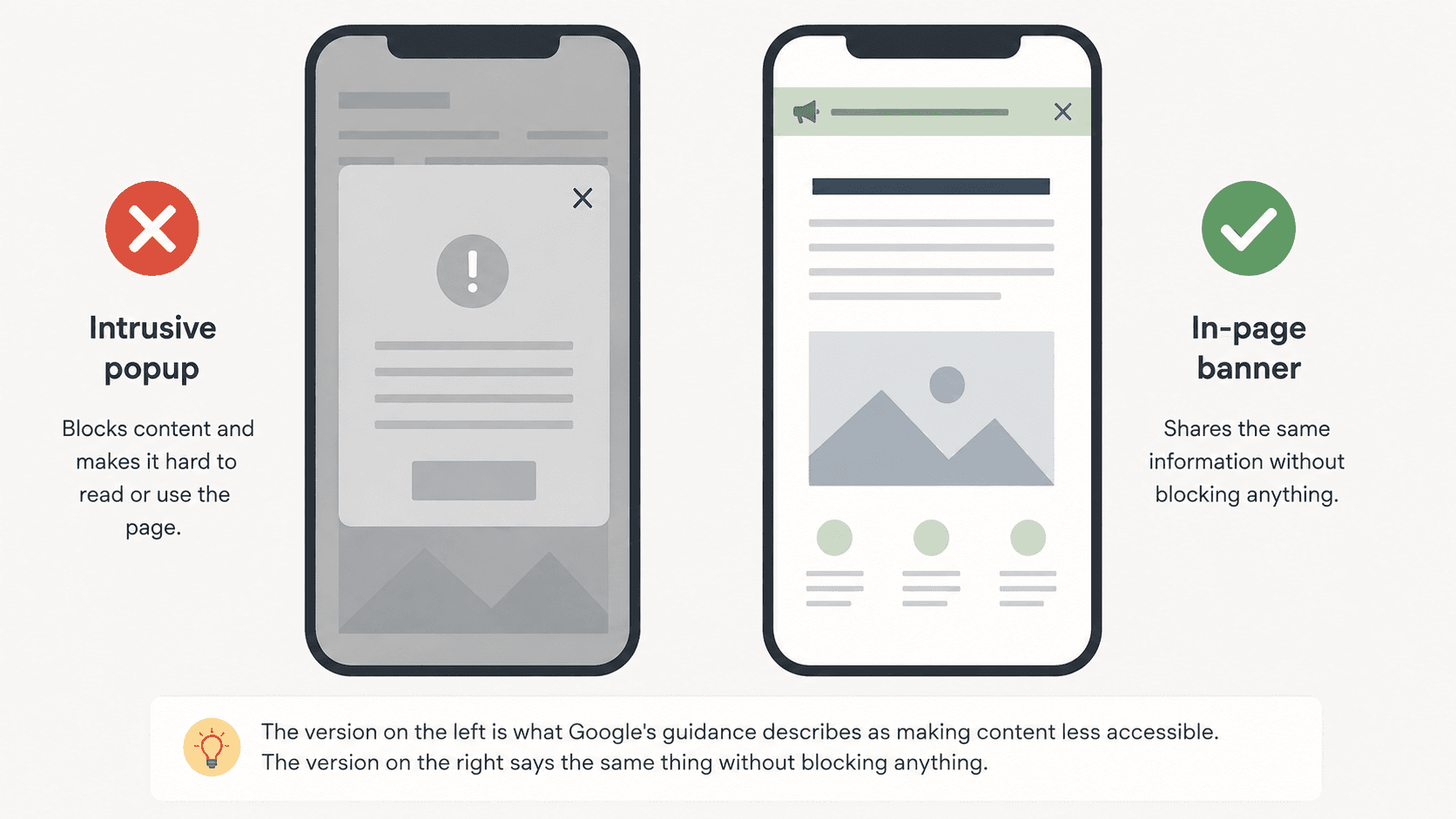
Google has been open about this for years. In guidance announced in 2016 and applied from January 2017, it said that pages where content is not easily accessible when someone arrives from mobile search results may not rank as highly. The examples it listed include showing a popup that covers the main content, and displaying a standalone screen the visitor has to dismiss before reading anything. Google also said this is one of hundreds of ranking signals, so a single announcement box will not sink a site with genuinely useful content. It is simply working against you rather than for you.
The same guidance is helpfully specific about what is fine: a banner that takes up a reasonable amount of screen space and is easy to dismiss. That is the shape an admission announcement should take.
One detail is worth noting, because it is often missed. Google's examples cover popups that obscure content "while they are looking through the page", not only on arrival. So delaying a covering dialog until the parent has scrolled does not make it acceptable. The better instinct is to keep announcements inside the page rather than on top of it.
There is also a weight problem. Popups are often added through heavy third-party plugins that load their own scripts, so an announcement that could have been a line of text ends up delaying the whole page.
For most schools, a clearly visible banner or a prominent section near the top of the homepage does the job, without standing between a parent and the reason they came.
8. Animation and trend-led design that gets in the way
This one is harder to argue against, because the demos look wonderful. Elements that fade in as you scroll, sections that slide sideways, large full-screen transitions between blocks, counters that tick up. In a portfolio these feel modern. On a school website they often work against the visitor.
Three things tend to go wrong. Content that appears only after an animation finishes is content the parent has to wait for, and on a slower phone those animations can stutter badly. Unusual scrolling behaviour breaks the one interaction everybody already understands. And motion-heavy pages are genuinely uncomfortable for some people, including anyone sensitive to motion.
There is a simpler test I would apply to any animation on a school website: does it help someone find information faster, or does it delay them? A gentle fade as a section comes into view is fine. A homepage that has to be watched before it can be read is not. Picture the actual visitor — often a working parent, on a phone, late at night, looking for a fee structure or an admission date. Design for that person and the site will feel good to everyone else too.
9. Designing for desktop and adapting for mobile afterwards
Most parents will see your website on a phone. Yet in nearly every review meeting I have attended, the design is presented on a large monitor, approved on a large monitor, and only checked on a phone at the end.
The result is familiar. A wide landscape hero image gets cropped awkwardly on a narrow screen, or it keeps its shape and the headline placed over it overflows or becomes unreadable. Videos and embedded frames that were fine on office broadband crawl on mobile data. Tables of fees or timetables run off the edge.
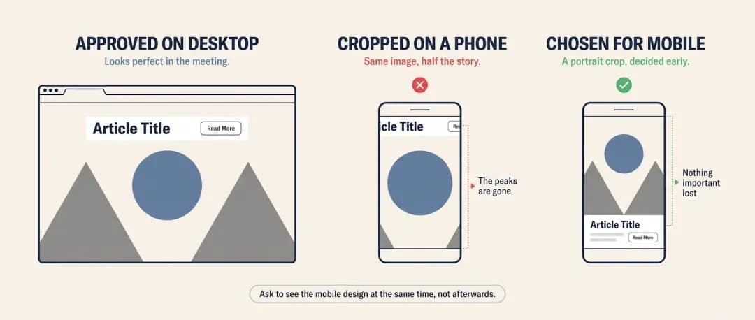
Ask to see the mobile design at the same time as the desktop design, not afterwards. For the hero section specifically, it is entirely reasonable to use a different image chosen and cropped for portrait screens, or to show a still image on mobile in place of a video. Note that hiding something with styling is not the same as not loading it, so ask your developer to actually load the lighter option on phones rather than hide the heavy one.
Then check the finished site on a real mid-range phone, not just a desktop browser resized to look narrow.
10. A content system the school cannot actually use
This is the mistake with the longest tail, and it shows up at exactly the wrong moment. Admission season opens. The school needs a new page with dates and instructions, or a single corrected line on an existing one. The request goes to an external team, and it takes days or weeks. By the time it is live, the moment has passed.
"A school should not need a developer to publish an admission notice."
What to look for is straightforward. Someone in the school office, without technical training, should be able to edit text and images on existing pages, create a new page, place it under the right section of the menu, and upload a document. Ask to see this done live during a demo, by a member of your own staff rather than the vendor.
Just as important is being able to build a page from ready-made sections. If your system offers blocks such as text with an image, a table, an FAQ, and a photo grid, your staff can assemble a new admissions page by choosing the sections they need and arranging them, without a new design cycle each time. Most platforms offer some version of this, under various names. What matters is that it exists and that your team can use it.
On platform choice, you do not need to have an opinion about the technology, but it is fair to ask what your options mean for you in practice. Some setups handle image sizing and page structure well by default and can update a single page without rebuilding the whole site, which reduces how much depends on add-ons. Any of the mainstream options can serve a school perfectly well when it is set up and maintained properly. The question worth asking is not which platform is fashionable, but how quickly your team can publish something on a Monday morning in admission season.
11. Changing every URL during a redesign
This one is invisible until it is expensive. A school redesigns its website and, along the way, the addresses of pages change. /admissions becomes /admissions-2026. /about-school becomes /about-us. The new site looks better in every way, and then search traffic falls.
The reason is simple. Search engines had those old addresses indexed, and parents may have them bookmarked or saved in old messages. If nothing tells them where a page has moved, they arrive at an error instead.
Before a redesign goes live, ask for a list of the current pages and where each one will point on the new site. Where an address changes, a permanent redirect should send visitors and search engines to the new location. Keep a submitted sitemap so search engines can find the new structure, and check for broken links in the first week after launch rather than the first month.
While you are there, one related habit worth breaking: putting information into PDFs when it could be a web page. PDFs are awkward to read on phones and much weaker in search. Use them for forms that genuinely need printing, not for admission details a parent should be able to read on a page.
12. Cheap hosting, and no maintenance plan
Hosting is where the saving is most visible and the cost is most hidden. I have recommended a properly managed host and been told it was too expensive, and the school has gone with a five-dollar shared plan instead. The site is then occasionally unreachable, pages crawl exactly when traffic is highest, and the administration panel becomes so slow that staff quietly avoid updating anything. A cheap server does not only lose you visitors, it erodes your own team's willingness to keep the site current.
How much this matters depends on how the site is built. Some sites assemble every page from a database when it is requested, so the quality of the host affects visitors and staff alike. Others serve pre-generated pages from a delivery network and are far more forgiving. Ask your developer which describes your site. If it is the first, hosting is a real line item rather than the place to economise.
You do not need to compare specifications. Ask what uptime is committed to, how the administration panel feels on a demonstration site, whether backups are automatic and how you would restore one, and who to call when the site is down. Serving images and video through a content delivery network helps whichever host you choose.
Maintenance is the part that gets forgotten. Certificates expire, and browsers then show parents a security warning about your school. Plugins go out of date. Forms break. Decide who owns renewals and updates, put a recurring reminder in a calendar, and confirm once that the whole site loads over HTTPS rather than only some pages.
13. No analytics, no Search Console
Most of the problems in this list are hard to notice from the inside, because the school office visits its own site on a fast connection and knows exactly where everything is.
Two free tools change that. An analytics tool shows which pages parents actually visit, where they arrive from, and how many reach your enquiry form. Google Search Console shows what people searched before finding you, and flags pages search engines cannot read. Together they turn arguments about the website into questions with answers.
If you have neither, that is the cheapest thing on this list to fix, and I would do it before anything else. You cannot judge a redesign without a baseline from before it.
What I would actually do first
If this list feels like a lot, it is. Nobody fixes thirteen things at once, and you do not need to.
Start by finding out where you stand. Open your homepage and your admissions page on your own phone, on mobile data, and time how long it takes before you can read something useful. Then run both through PageSpeed Insights. Then ask a member of the office staff to publish a small change while you watch.
Those three tests take an afternoon, and they will tell you which items on this list are your items.
What this costs varies more than lists like this usually admit. Fewer photographs, clearer menu labels, an obvious admissions button and a monthly test of your own form cost attention rather than money. Better hosting, a content system your staff can actually use, or a site rebuilt properly for phones are real expenses — which is exactly why they are worth deciding during a build or a planned redesign, when they cost a fraction of what the same decision costs as a retrofit later.
A one-afternoon audit you can run yourself
Open your homepage on your own phone, on mobile data, and count the seconds before you can read something useful. Do the same for your admissions page.
Run both pages through Google PageSpeed Insights on the mobile setting, and note anything marked as a problem.
Check that a parent landing on your homepage can find how to apply within one obvious click.
Submit your own enquiry form and confirm where it arrives, and who is responsible for replying.
Ask a member of the office staff to publish a small text change while you watch, and time it.
Confirm your certificate expiry date, and whether analytics and Google Search Console are installed.
Frequently Asked Questions
